British culture

These are my final artifacts that I have created since the beginning of starting my design research project. My competition brief consisted me creating a typographical design that captures the quotes from the British sound library. My personal brief is where I created an illustrative book and collective postcard to celebrate the stereotypes in Britain. Both my briefs combined have the same theme, the British culture.

 (unfortunately, Blogger wont load the other photos at the moment, so I will try again another time)

Business presentation


Today at 4 pm , my team and I had a presentation infront two business judges and two tutors.
Our lazy student business concept is to  pick up & drop off laundry and essentials at the same time. Below are a few images of my team members and our brand. 


Finalising my research stage

I found some examples of what style of illustrative book style there are and how I would be able to bind it. Below is an image of what I have found, the next stage is to choose one that is appropriate to my style.Once I have found the right form of photo book I want to use, I am ready to print off my artifact ready to be submitted next week.

Printing

For my competition brief I have to create a typographical final piece and I have created some prints using woodblocks .
The quotes are from the British Library - Accents & Dialects .
They are mostly males from the early 1900's talking about their lives and working as a primary industrial job such as farming and mining.


I will further develop these prints by using different materials that could change the texture and feel, rather than just keep using the crisp white A3 paper. I found this technique quite time consuming and difficult to get the perfect print . I really like how on some of the prints, the ink has not transferred fully, I feel it gives are really old vintage look, which really exaggerates who/when and what time era the quotes were said.

creating my identity

Looking through colour schemes is an important aspect in creating an identity for myself. Of all the forms of non-verbal communication, colour is the most instantaneous method of conveying messages and meanings. I have looked through books, analysing what each colours mean and say about something.


At first I was leaning towards colours from the warm tonal range, however I came across complimentary colours . Complimentary colours are opposite colours of the colour wheel. They are supposed to enhance each other and look complete when these two colours are paired together. 

This is when I started to look at colours that looked playful, and clashed with each other but still looked aesthetically pleasing. 

I had stated previously that I want my identity to be unique and be colourful yet simple. I think the best way forward is for me to use complimentary colours but change the tone so its one of a kind.

British Culture collage

I have been working on creating a final piece for my personal brief, but before that I have started to research stereotypical sayings from London,
How the stereotype of London and other regions have created our British culture.
London stereotypes are... Iconic buildings, the royal family, tea, posh , gloomy, rains all the time ..

I have also done the same for Yorkshire ....

Below are the examples of how I have developed my collages onto Photoshop.
I have handmade some collages , then scanned them in to create a further developed collage on Photoshop.


Individual Identity

My essay is due this Thursday, so once this has been submitted I will start to focus more on creating an identity of my own for promotional design. I have been looking at examples that was provided for us and I was inspired to create a simple , yet colourful personal development plan (PDP). I have been keeping a journal since the start of uni, in October. So it will be easy for me to copy and paste my own writing in my PDP. I need to start to create my PDP template & style on InDesign and think about my own business cards and how I want to present myself.

Here is an example I found from Behance that is really colourful, but its not as simple as I want it to be. My tone Of colour wont be as vibrant as this because its not my taste.


Behance

Behance is an online website, for designers to publish their portfolio for everyone to see. This website was recommended to me from my tutor. It has a lot of work published by designers in all creative industries. I focused looking at illustrations and Graphic Design. This is a great way for my work to be seen and creates opportunities for me because potential companies might want my style of work.


Easter break

I have noticed this Easter, the packaging for Easter eggs are not just the same old rectangular boxes you see every year. There are designs that are really aesthetic and compliments the Easter egg the company is selling.
Here are a few examples I have seen...


exhibition thoughts

We are starting to think about possible projects we want to exhibit and how we want to present ourselves as an individual to showcase our own style for our viewers. I collected some items from last years degree show to inspire myself.


Here are the front and back of some business cards. They are all unique and very different from each other.


Here are how some students presented there work last year. I really like these and I will be doing something similar for my personal project. 


These three images are taken from an information brochure that was provided by a degree show. It tells me where to go, where everything is and how to get there. The top picture is the front cover, but you can see from the second one it fully opens up to a panoramic shot of the room. When you turn it around it becomes a poster. This is like a 3 in 1 information brochure/poster/booklet.

Typography experimentation

Below are images taken from my research sketchbook.


After my research, I came up with a concept to solve the sound bite brief. When listening to the accents and dialects in their recordings, what I found out was that the older generation of speakers (above 50years old) were saying how their jobs and accents were different compared to our younger generation of people (students in their 18 - 20's). The young speakers were talking about how the generation nowadays create new languages (slang/shortened words) that the older people might not understand.


Solution: My typographical solution is to create 3 posters that show how the generation of accents and dialects are changing , just like how the printing methods have. The first type of printing method I will use for my first poster to signify the older generation is letterpress. This process is (man-made) hand done. I will then use digital printing for my second poster which is done with a machine. Finally my third poster will use a combination of hand and digital techniques.


Sound Library

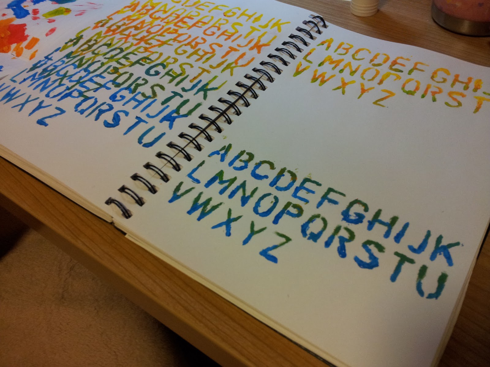
Continuing my competition brief for design research project module. The brief is created by 2013.2 student assessment projects, international society of typographic designers. I chose on this brief to allow me to create a typographic piece for my portfolio. My client are Sound Bites British Library, they have asked to design a submission that investigates sound and recordings from their digital collections.
It is to be essentially typographic and I can use any methods and media to convey my solution.

Competition Brief -
British Library Sounds presents over 50,000
recordings that cover a vast range of themes –
from music, drama and literature, to oral history,
wildlife and environmental sounds. Categories in
the collection include: Accents and Dialects; Arts,
Literature and Performance; Classical Music;
Environment and Nature; Jazz and Popular Music;
Oral History; Sound Recording History; World
and Traditional Music; Sound Maps.
We want you to focus on the Accents and Dialects
category of the collection by going to the
following link:
http://sounds.bl.uk/information/public-collections
Ensure that you select only the following categories
under ‘Public Collections’ –
• Number 4  BBC Voices and/or
• Number 40  Survey of English Dialects
As in countries around the world, the United
Kingdom is made up of a rich tapestry of accents
and dialects, from Buchan Doric to the Scouse of
‘The Boys from The Blackstuff’ (‘gie’s a job’) …
from ‘Rab C Nesbitt’ to ‘Gavin and Stacey’ … from
‘Eastenders’ to ‘Emmerdale’. Accents are important
– they characterise us as individuals and communities,
reflect our urban and rural identities and, undoubtedly,
act as a mark of social status – think of the Received
Pronunciation that still defines Radio 4. An accent
can be a transient thing, depending on where we
move to and how our lives change.
 
The Brief
You are required to design a submission that
investigates sound recordings selected from the
British Library Sounds digital collections. This brief
presents you with the opportunity to express the
essence and spirit of your chosen sound recordings.
You may wish to edit and select appropriate ‘sound
bites’ from these audio clips or use transcripts for
your text matter. Consider the juxtaposition of your
chosen recordings – do they have anything in
common? Do they address similar issues/themes?
Are they opposites? Or simply celebrate the emotions
that are aroused by your chosen words.
Consider the way that different accents may suggest
particular fonts – some bolder, some softer, sharp,
distressed, condensed, thin, fat, serif/sans serif etc.
You decide – the possibilities are endless.
Use whatever methods and media you consider
appropriate to convey your solution effectively –
as long as you express a solid idea, inform us and
show us your typographic skills. Make sure that you
incorporate typographically detailed text matter that
expresses an information hierarchy. Remember that
words and language are our collateral and that your
submission should be essentially typographic.

Target Market
Educationalists, social historians, design professionals
and a discerning public
Submission Guidance/Requirements
Your project submission should include sufficient
appropriate material to show that you have
addressed the brief comprehensively and clearly
expressed your design and typographic skills.

It must include:
•  Strategy
•  Research and design development
•  Specifications/Grid(s)
•  Final outcomes
•  Disc showing development and presentation 
 images of  your project
Cross-reference this project brief with the
Assessment Criteria guidance notes.
SOUND BITES

Albatross

My final T-shirt design for Albatross. My inspiration was the patterns and colours that paperchase use for their own stationary collections. I based mine on the albatross logo and enhanced it so that it was more geometric. My design really stands out from the white coloured shirt,  the pastel and fluorescent colours compliment each other nicely. I did two designs because I wanted it to be a 'his and hers' item.


Batiste


Looking through some trends, my final design ideas came from geometric shapes and stripping the logo back to its most basic. I focused on taking away the patterns and graphics that the usual hairspray bottles have and focused on the gradient colours . The top two are geometric shapes which i thought was really interesting to try out that trend.

Here is what it would look like if it was to be produced...


This is the selling point that I imagine the new Batiste Hairspray would be presented in.